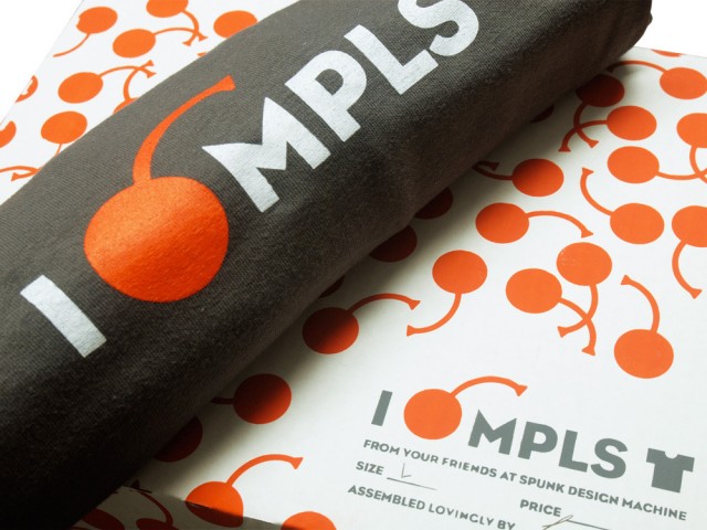
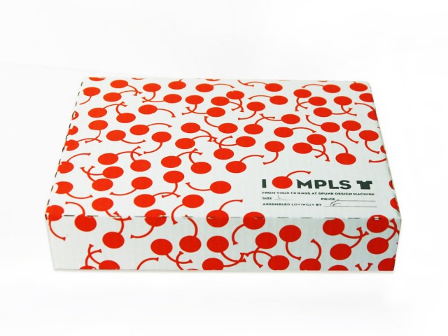
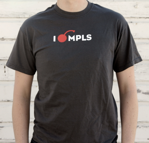
Our “I Cherry MPLS” shirt will soon pop up in the Walker Art Center shop. This sweet screen printed packaging we cooked up, along with a mini-poster, will only be available if you purchase the shirt at the Walker. That’s why we call it premium, folks.
Category: Uncategorized
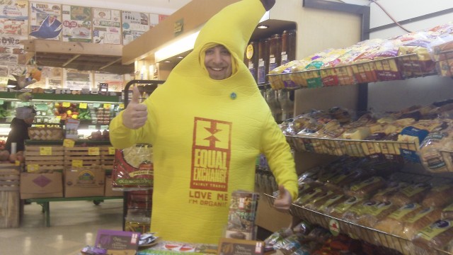
Banana on tour out East!
Duffy Design Smoke
Spunk Store Open for Business!
 It’s been a long time coming: The Spunk Store is officially open for business. Starting small with t-shirts and prints, but stay tuned for more Spunk merch soon!
Eco-fountain Keeps Track
Spunk client and friend Nathan Dungan sent this over to us – he spotted this eco-conscious water fountain while he speaking at a Brentwood school in L.A. It gives you a little positive reinforcement for bringing and refilling your own reusable water bottle instead of buying water in plastic bottles. As Nathan says, ” The choices we make with our money can change the world!”
African Star Wars Masks
 Friend of Spunk, Alex Griendling has been doing some dork-a-liscous Star Wars fan illustrations in the style of African masks, like this version of a Stormtrooper helmet. I love these masks. Head over and check out the rest here. -Jj
Money Sanity Solutions Book Launch
 Nathan Dungan’s new book Money Sanity Solutions launched last week at a party held at Casa Verde in south Minneapolis. Nathan (the nicest guy you’ll ever meet) gave a quick presentation on the book and exploring your family’s money narrative. Spunk designed the book, so we were invited (and won the worst dressed award). Please check out Share Save Spend and get a copy of Money Sanity Solutions (includes a dvd!) for yourself.
Choose Sustainable Shipping
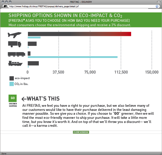
This is cool: Spunk’s own Craig Johnson is exploring sustainable shipping options in a project for the Sustainability/Measuring and Communication Life Cycle class at MCAD. Here’s part of a mock study of how online retailers could position their shipping to customers to allow them to make the most eco-sensitive choice. His project’s titled A look at reuse, energy savings through shipping options and end-of-life rethinking.
Tack an option onto online shopping carts that illustrates the eco-impact and CO2 levels of different shipping choices in a way that helps a consumer understand. It would allow the customer to make a “positive” choice by understanding the problem in environmental terms. Shipping something “next day” is often more expensive, hard on the business and hard on the environment. Retailers could even offer a small discount for eco-shipping (karma credit, if you will).
These are the ideas Spunk can deliver to clients – design that helps consumers to feel good about “their” choice in a product, service or company and on top of it all, the business would save some money and help the environment. Every little bit helps…
Hey Apple, Stop Tasting the Rainbow
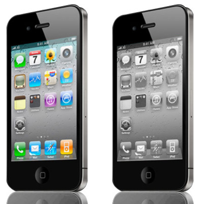
So I love my iPhone like no other – seriously, it’s really made my job a lot easier (and made bedtime stories easier, and bedtime youtube…) But I’m sort of weary of the tutti-frutti colored app page. It’s like a kindergarten classroom – not that I don’t like kindergarten classrooms, just not all the time. Seems like the iPhone should have a “Greyscale” option for the home page, or a “Minimized icon” choice where a single-color icon option for each app could be used. Call me a design elitist if you like, I’m just weary of the rainbow of fruit flavors. I had a similar feeling with the ’99 Macs that all featured Skittle colors in the hard plastic. Great a first, but then just tiring.
-jj
FRANKENPUTER LIVES!
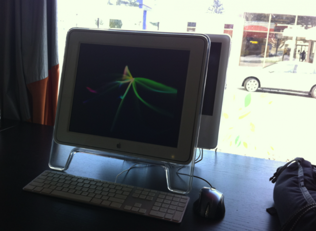
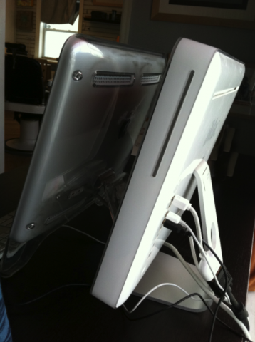
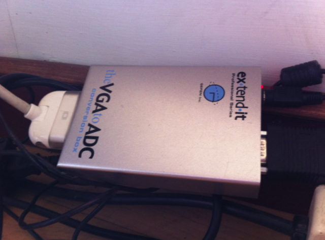
This is a reason to keep a well stocked tech drawer of seemingly useless computer supplies. This G5 iMac had a motherboard fry that left the screen long since dead. We figured out how to patch a 2001 Apple Studio display through some spooky off-brand coverter kit and Voilá! we have a functioning G5 iMac Frankenputer!
We have several of these chimaeras fueling the Spunk Design Machine.

