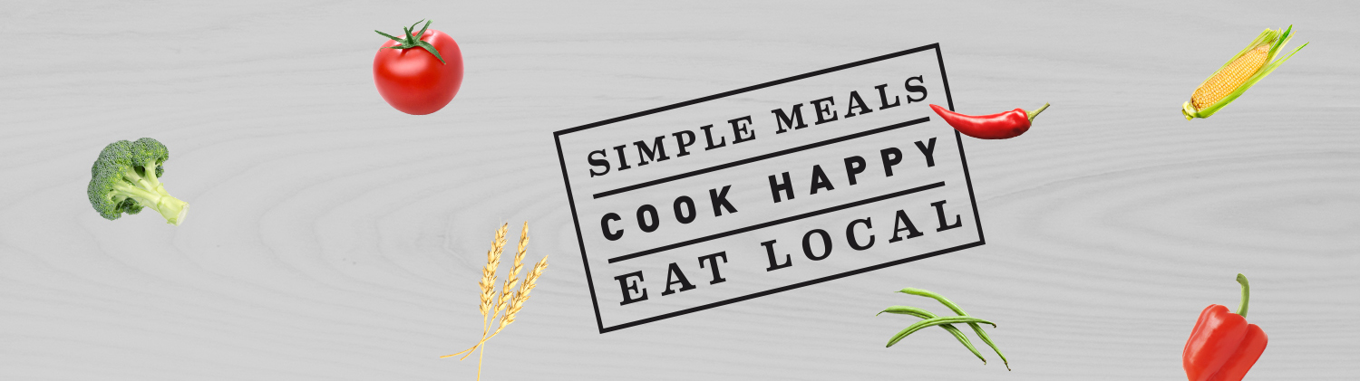
Go Local Crate!! We are soooooooo damn glad to finally get to crow about this amazing new MN food brand we have been naming and designing for over a year. Local Crate is the brain child of two veteran MN food industry execs that wanted something simple. To deliver better food for a better world. Check it out! great fresh meals delivered right to your door. Open up the Crate!
Visit their website here and make sure to visit their Kickstarter page here.
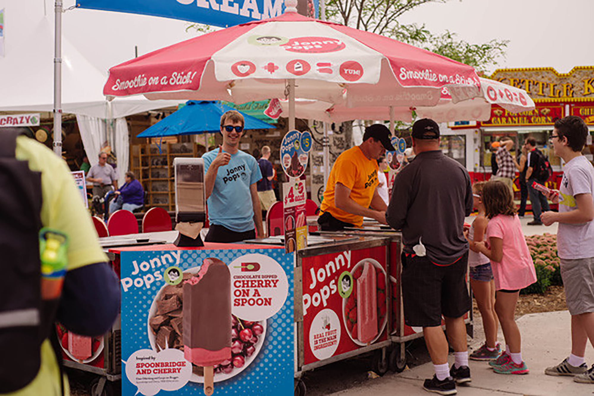
Hey ! Thanks Heavy Table! This year we invented a great new flavor for Jonny Pops client. Chocolate Cherry on a Spoon! Inspired by our friends and partners at the Walker Art Center who are total rock stars. We introduced our JP client to our friends and collaborators at the Walker, introduced them to our Chocolate Cheery on a Spoon concept – and Boom! The magic was made. Only at the State Fair, so get em while they are cold. Check out the article here!
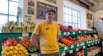
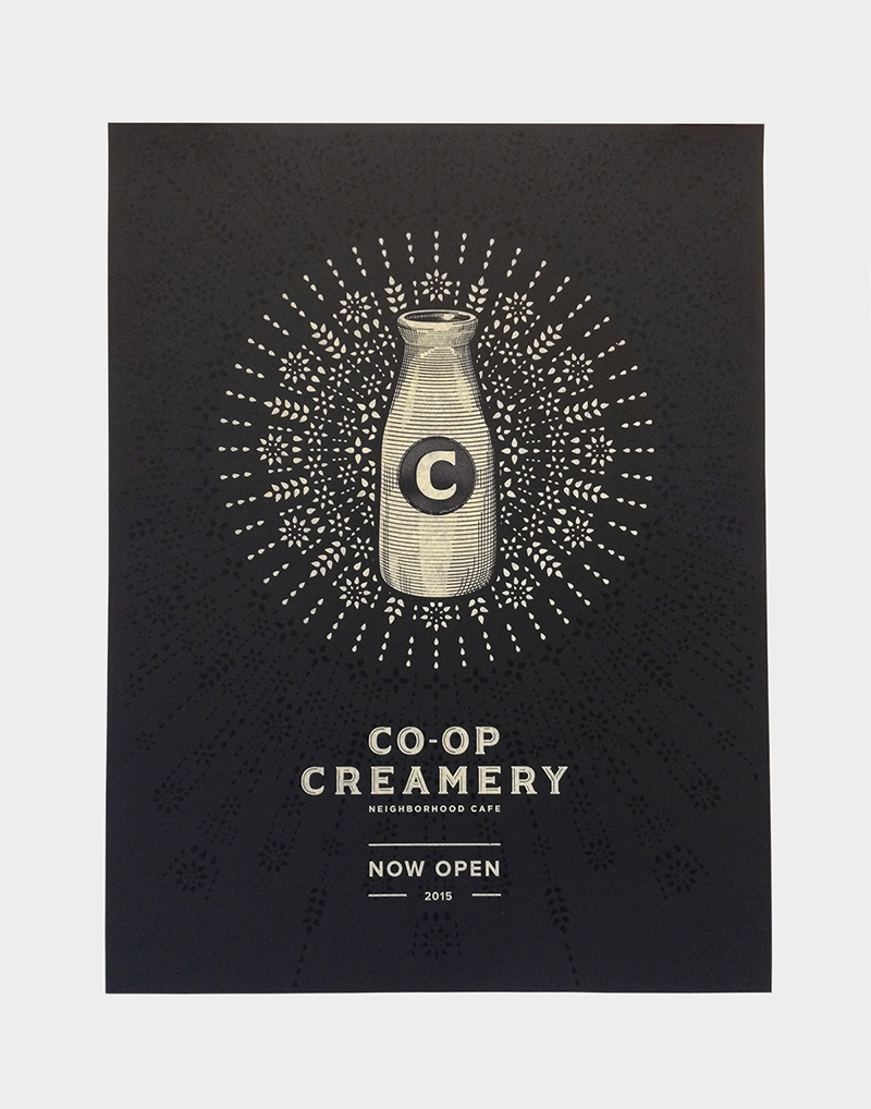
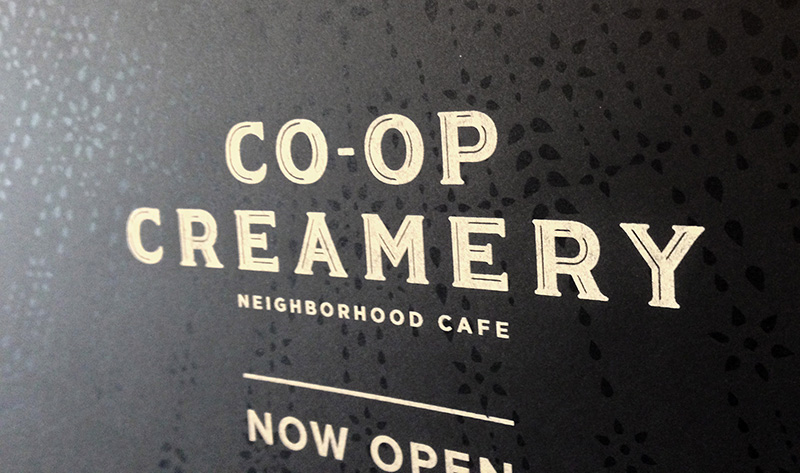
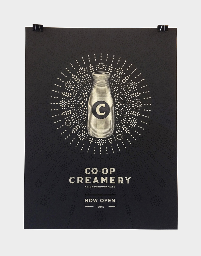
Bravo Coop Creamery! Replace was lucky enough to name and design this great brand for our awesome Seward Coop clients. 2 years in the making! Come on down and beer up!
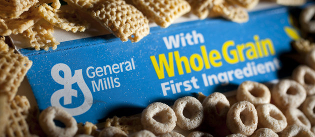
So we are lucky enough to design the brand 301 Inc. This is the innovation division of General Mills. They are real deal. And here is what the real deal looks like. Read this interesting article about future global food shortages here. Bravo Big G.
The end of the month is the opening of the new coop creamery bistro we were honored to name and design . We pulled a commemorative limited edition print for staff and friends. Bravo Dan Shearen,Lucas Richards and Dustin Hackwith on this amazing design – and bravo Seward coop.
June 3rd the choral organization VocalEssence will perform with the Rolling Stones! It should be a rockin good time over at the TCF stadium. You can pick up tickets here.
We couldn’t be happier to announce a recent partnership between our clients Jonny Pops and Minnesota art establishment, the Walker Art Center. Not only did Replace help facilitate this brilliant meeting of minds, but also presented the flavor pairing for this partnership. Seeing the new pop come to life couldn’t be sweeter for us!
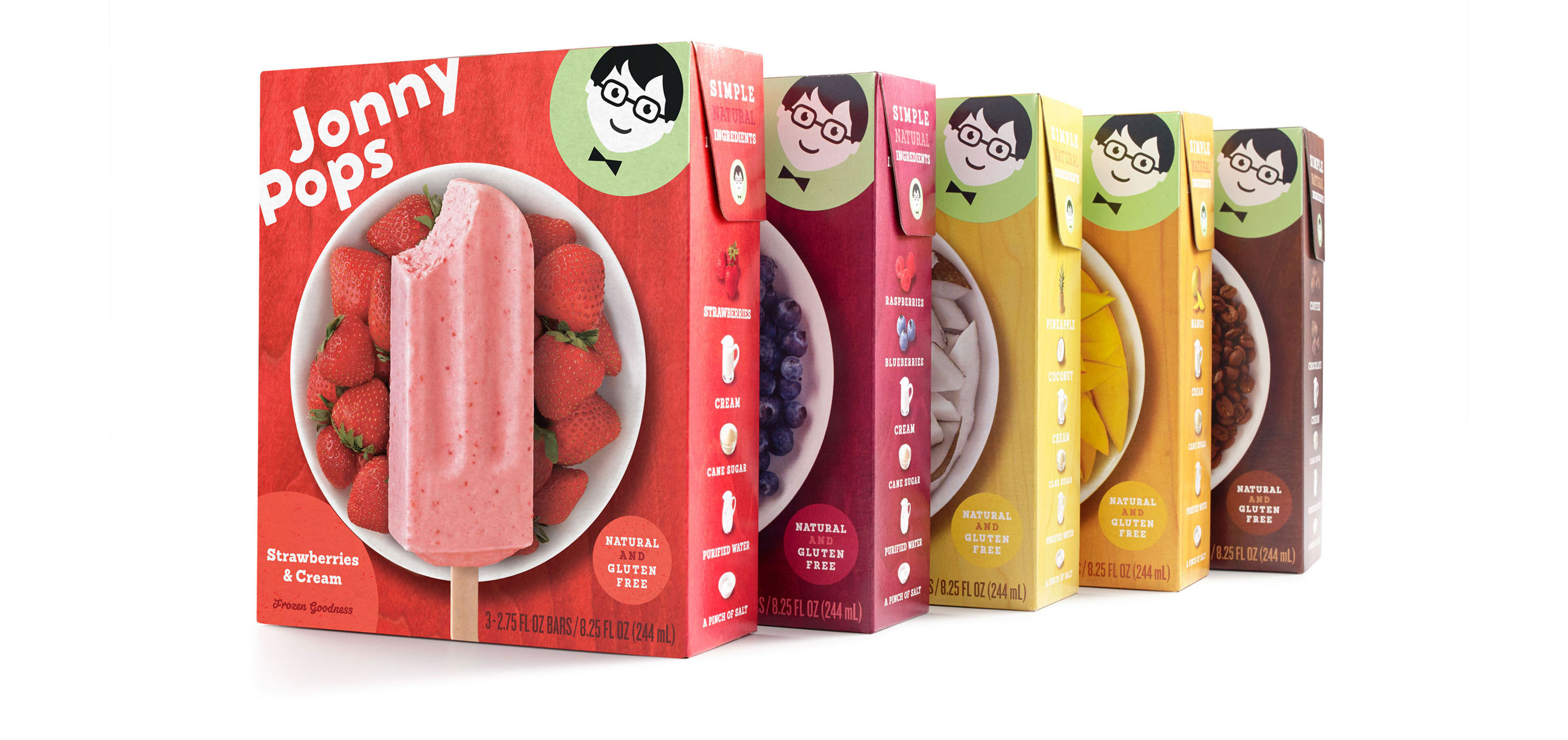
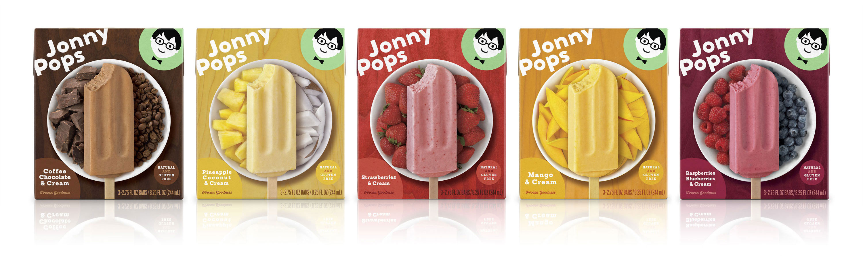
We are proud to see our work on The Dieline today! We worked hard to design a family of packages that quickly and clearly communicates the pillars of the brand: pure & simple ingredients, great flavor, and social mission. The challenge was to create a cohesive family of packages that quickly grabs attention while also efficiently communicating flavor and simple ingredients. The new Jonny Pops packaging can be seen in select stores now!
Check out the Dieline post here. You can also view our full Jonny Pops Case Study here


